You are using an out of date browser. It may not display this or other websites correctly.
You should upgrade or use an alternative browser.
You should upgrade or use an alternative browser.
Beardown about Uniforms - don we now our ghey apparel
- Thread starter purple112
- Start date
jdlikewhoa
Well-Known Member
BearDownUofA
Festizio
Is there a particular reason why they couldn't do green vs. red?

silverwheels
Thudner Up
prolly because nike already made a bunch of retail versions of the white jerseys assuming that alabama would beat ohio state, making oregon the road team in the shampship. gotta sell that merch


Why is Oregon wearing white anyway? They are the higher seeded team shouldn't they also be the home team?
If they were doing white, at least do the whites on the right of @Brick's post, those are badass. All white with green numbers, letters and accents. Maybe add yellow trim if you want to get fancy. I'd like those uniforms as an October road game in Palo Alto uniform, but a National Championship Game against a team whose secondary color is gray? Weak sauce.
Green and yellow, especially those shades of green and yellow, are distinctive and badass. Everything they do should be green and yellow with the occasional all white or all black look when they want to sell some t-shirts. I love 99% of Oregon's uniform combinations but this is not ideal. Ducks you have a week to fix it, go.

RedmondLonghorn
#LOB
Like school colors are a constraint for Oregon...
Bruce Wayne
Well-Known Member
Oregon is okay.
tOSU is hideous.
tOSU is hideous.
RedmondLonghorn
#LOB
this is making me irrationally angry. so dumb.
Funny. I am a Washington grad and a certified Duck hater and I like the uniforms they are wearing. Of course, I like a number of the disco fashion uniforms Oregon has worn over the years.

Wow. I didn't know that the Raiders are in Oregon.
BearDownUofA
Festizio
They should be. The NCAA is way past due on instituting uniform restrictions. This shit needs to stop.Like school colors are a constraint for Oregon...
coogrfan
Well-Known Member
They should be. The NCAA is way past due on instituting uniform restrictions. This shit needs to stop.
"This too shall pass."
Brick
BALL WATCHER
also, dad jeans.Funny. I am a Washington grad and a certified Duck hater and I like the uniforms they are wearing. Of course, I like a number of the disco fashion uniforms Oregon has worn over the years.
BasinBictory
OUT with the GOUT
Wow. I didn't know that the Raiders are in Oregon.
A team with shitty fans? Perfect uniforms, then.
RedmondLonghorn
#LOB
also, dad jeans.
I appreciate the fashion advice, but I think your boss needs his coffee.
Wooly
Well-Known Member
also, dad jeans.
Grown men concerning themselves with what other grown men wear....?
RedmondLonghorn
#LOB
Grown men concerning themselves with what other grown men wear....?
No, it was Brick
BasinBictory
OUT with the GOUT
Ah - so I see @GR8 2B FL G8R's real name is Freddie DeBoer. Interesting.
Wooly
Well-Known Member
This is what happens when you don't feed the kids in Bangledesh who are sewing them on, they get jittery. Come on Nike, give them a damn lunch break already.
Iron
Well-Known Member
The black numbers on OSUs shoulders are so.... unnecessary
BFBS
Those are awesome. The gradient facemask on the white helmet isn't the best but the rest of it is badass. Would love to see one of those helmets with the Roadrunner logo on it as well.

RedmondLonghorn
#LOB
Those are awesome. The gradient facemask on the white helmet isn't the best but the rest of it is badass. Would love to see one of those helmets with the Roadrunner logo on it as well.
Road runner on one side, UTSA on the other.


BasinBictory
OUT with the GOUT
Still awaiting the first school to have flames on the helmet with fuzzy dice hanging from the face mask. Will team up with Beardown to firebomb that school.
silverwheels
Thudner Up
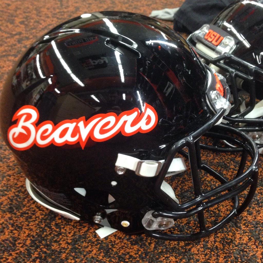
dammit. i can't find the exact stuffed beaver that gobeavs used to have as his avatar on oldtopia. this one is close enough:


BearDownUofA
Festizio
Boring is good these days.
coogrfan
Well-Known Member
Boring.
It's my understanding that those helmets are just for spring practice.
Last edited:
jamesnathan
Resident Mormon
NCAA rule bans players from wearing cropped jerseys in games
I love the part where players say they'll tuck their jerseys all next season in protest. Yeah. I'm sure your coach supports you in that. Glad you spoke up before talking to him first. Whether you agree with the rule or not, have fun with that.
I love the part where players say they'll tuck their jerseys all next season in protest. Yeah. I'm sure your coach supports you in that. Glad you spoke up before talking to him first. Whether you agree with the rule or not, have fun with that.

Sigh.

watNCAA rule bans players from wearing cropped jerseys in games
I love the part where players say they'll tuck their jerseys all next season in protest. Yeah. I'm sure your coach supports you in that. Glad you spoke up before talking to him first. Whether you agree with the rule or not, have fun with that.